
August 24, 2017 - by Manan Thakkar
It is often said that developers must start with the customer experience and work back towards technology – not the other way around. And, well, that’s the absolute truth. User experience is everything, as it always has been. If a customer finds your website or app unexciting or perplexing, it’s likely they will choose a rival over you. In fact, Forrester Research reports that a “well-constructed user interface can increase the conversion rate of your website by up to 200% and a better UX design can achieve conversion rates of up to 400%.” With numbers like that, you can’t pass up improving your end-user experience. Let’s take a closer look at how you can achieve the strongest end-user experience, and how Synoptek can help.
User experience always comes first. Your site or app has an enduring impact on a user – and whether that impression is good or bad can depend on many factors. We’ve assembled a list of 10 ways you can enrich your app and/or website to make it more valuable and supportive.
User interface is like a joke – if you have to explain it, it’s not good enough! Usability helps users find what they need faster, and is the foundation of delightful experiences. Make sure to clearly label icons with defined functions. Choose an optimum font size. Ensure your application functions logically. Always remember that users do not have the time or patience to try to figure out how to navigate the application to accomplish tasks – intuitiveness is key!

Often, lack of consistency can bring on a lack of interest. If you want your app to be taken seriously, be consistent. Consistency means making everything match: heading sizes, font choices, coloring, button styles, spacing, design elements, illustration styles, and photo choices. Everything should be themed to make your design coherent on the same page as well as between pages. Consistency ensures people transfer knowledge to new contexts quickly and learn new things without much effort. Make sure users can easily execute tasks on your app, and not waste valuable time learning how your UI works. Remember, usability and learnability improve when similar elements have a consistent look and function in a similar way.

Knowledge is like paint; it does not look good unless it is applied! Knowledge management will never work until you realize it’s not about how you capture knowledge, but how you create and leverage it. For a great user experience, it is critical your app supports the concept of knowledge management. Users should be able to easily search for knowledge articles and solve problems on their own. Empowering users to easily find information is a crucial component to any website/software/application. Search options should be clearly defined within the application, which should be stocked with answers to the most common questions. Remember: your goal is to enable users to help themselves.

Design is less about how your app looks, and more about how well it works. It only takes a few extra seconds of page load time to lose a visitor. It’s true that fancy widgets and elaborate JavaScript can make for an impressive user interface, but at the end of the day, speed trumps creativity. Remember, users don’t want to use a website they can’t interact with quickly and effectively.

The language you use largely influences the way your users perceive you. All your users expect is to be able to quickly extract information and take instant action. One of the biggest factors in converting visitors is making sure the content and links are readable, understandable, and grammatically correct. Good language promotes credibility and trust in your website (and business), so it’s very important to get this right. Remember, your target audience always has to be able to understand you.

Clarity comes from action, not thought. Many times, in a bid to convey a lot of information, websites and apps end up looking messy and cluttered – cluttered with information that just doesn’t belong there. The more items you cram on a webpage, the more you confuse, distract, and frustrate the visitor. Remember, lack of readability can put brakes on your journey to success. So always ensure good readability.

If you want to aim for improvement, you need people who give you constant feedback. Your users are a valuable resource for catching bugs and other usability issues. So go through those old emails and identify patterns. Are you missing out on some important features? Is there a trend in the complaints? In addition to feedback, you can also conduct surveys to know where your app stands. A well-crafted survey can tell you more about your site’s usability than you can find out by yourself. Remember, there are no failures, only feedback!

No matter how attractive and technologically forward your app/site is, you should always be mindful of whether or not you’re causing confusion and alienation while deviating from design standards and conventions. Ensure users do not have to spend time comprehending whether different words, interactions, or actions actually mean the same thing within the context of your product. Remember, your application should reflect its purpose, we need to be brief and to the point.

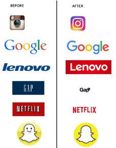
There is no beauty greater than simplicity. One way to ensure simplicity is to employ a flat design that emphasizes minimum use of elements but gives the illusion of three dimensions. Flat design is particularly important for small screens, offering a clean UI with clear next steps for users (such as a call to action). Focus on minimalism and simplicity, and ensure an uncluttered look.

A satisfied customer is the best business strategy of all! Today, graphic user interface (GUI) has become the norm to satisfy customers; using graphics, you can augment your app’s usability. Use a design that strikes a balance between technical functionalities and visual elements. Employ human-computer interaction techniques that offer an intuitive experience through cutting-edge natural user interface (NUI), innovative brain controlled interfaces (BCI) and head up display (HUD). Remember, your goal should always be customer satisfaction. So work towards making your UI entertaining and giving people the information they want.

The less you have to explain your UI, the better the design. Your user interface is the face of your brand; it directly influences how visitors think of your company. If your user experiences a problem with your app or website, it is a catastrophe in disguise. So always make sure your UI is fast, easy to use, and readable. Pay attention to the consistency of information, and eliminate any confusion that might arise while using the app. Always take feedback in a positive manner, and implement changes to ensure your user is always engaged and entertained.
End-user experience can make or break an app. Learn how Synoptek can help ensure you have the entire app management process covered.